Avatars
An avatar is a visual representation of a user or entity.
An avatar acts as a proxy for a user or entity (such as a project, repository, or space), in a product. They're often combined with status or presence indicators to give more context. Users generally upload their own image, otherwise, a default image is displayed.
Use:
- circular avatars to quickly identify users
- square avatars to help identify large product entities like projects, spaces, groups, rooms, or repositories
- a presence indicator to indicate presence for a single user
- a status icon to indicate a user’s status in a product
Anatomy
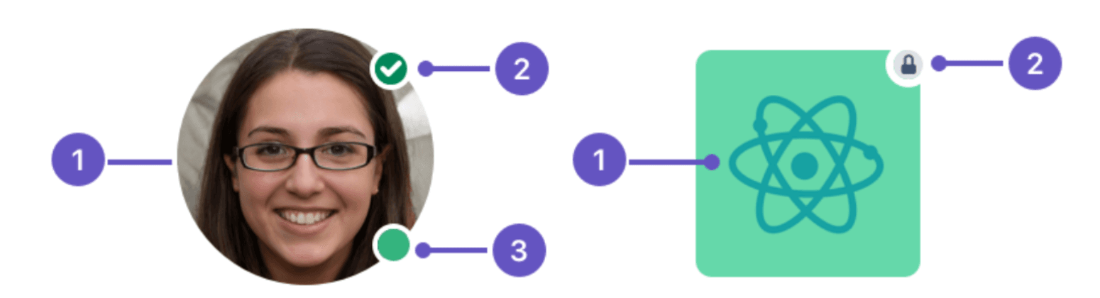
- Body: The image representing the user or entity.
- Status: An icon that displays the avatar’s status.
- Presence: Indicates if a user is available, away, focused, or busy.
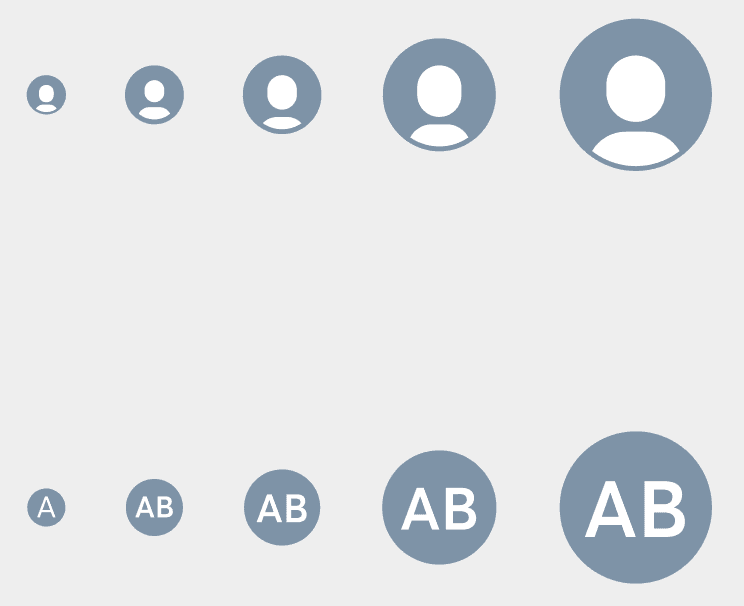
Default
A default image is displayed for avatars when a chosen source is unavailable (for example, when there is a problem displaying the image due to an error), or simply unspecified.
Appearance
Circle
Use a circle avatar to represent a person.
Square
Use square avatars to represent an entity, such as a project, repository or space.
States
Use disabled states to disable an avatar that is not usable. This sets the avatar image to 40% opacity using the opacity.disabled token.
Avoid using disabled UI, as it can cause accessibility problems.