Personality
Our brand is more than just a logo.
Our brand represents the collective experience, values, promises, and emotions associated with using the DataGuard solution.
Simple and confident
- The Guard, our heritage, remains reflected in the usage of the figurative logo mark (which is a guard, reduced to the max, reduced to hat with chinstrap)
- The wordmark of our logo is simple and bold ( the new version is simplified compared to the old one, “Data” and “Guard” are now the same font weight)
- There is only one main brand colour (DataGuard base blue). It stands for confidence & trust, professionalism and authority
We make our customers feel at ease. They feel that what was complex now it is easy to understand.
We make our customers feel at confident. They know they have an expert team by their side.
Integrated
- Our product (range) is the core of our company. Product colours are now part of the brand colour range (as highlight/accent colours)
- New brand colour scheme reflects our integrated product vision.
Positive and empowering
The shapes of our logo are utilised to give our hero layouts 2 implicit messages:
- The smile shape appears generally positive (customers should feel at ease, what was complicated is made easy...)
- The horizon shape reflects care/shelter/great possibilities/limitlessness

- The brand accent colours add a positive vibe to the serious DG base blue colour. The lighter shades of blue stand for peace and clarity. The purple stands for imagination and creativity.
- Red as a main brand colour is discontinued as it is a associated with warning colours.
We make our customers feel at inspired and empowered. They feel positive about their compliance journey. They can think beyond, any compliance challenge is now attainable.
Vibrant
We are now using a range of striking additional action colours:
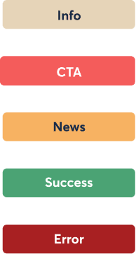
- The coral CTA colour stands for joy, optimism, and enthusiasm
- The yellow announcement colour stands for cheerfulness, warmth, and it captures attention
- The green colour stands for success and well-being
- The red alert colour stands for intensity, urgency, and warning